Hi friends!In this 3 part series we will learn about the principles of design and gain indepth knowledge of the each and every principles as it follows. In part 1 we will learn about different principles followed in static design
BALANCE:
It is a state of qualized tension and equilibrium, which may not always be calm it shows a sense of calmness in viewer's eyes.
Balance can be symmetrical ("formal"), where elements are given equal "weight" from an imaginary line in the middle of a piece. For the most basic example of symmetry, think of your eyes in relation to either side of your nose.Balance doesn't necessarily mean symmetry, though.Asymmetrical ("informal") balance occurs when elements are placed unevenly in a piece, but work together to produce harmony overall.
 |
| yin yang symbol is a classic example of balance. It shows weighy in colour on both the sides |
 |
| the blue colour, the design and the white tone is followed on both sides of the painting |
CONTRAST:Contrast occurs when two elements on a page are different. For example, it could be different colors between the text and the background color. It could be a heading set in a big, bold, grungy font combined with a sans-serif font for the body text. It could be a difference between a large graphic and a small graphic or it could be a rough texture combined with a smooth texture. Our eyes like contrast.
The important thing about contrast is that the elements should be completely different. Not just a little bit different.
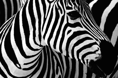 |
| zebra's stripes are classic example of two contrasting colours conflicting the same space |
 |
| in this photo the contrast in colours shows dominnace of the flower |
Contrast is not only shown through colour but also the placement and difference in posture or placement for example;
VARIETY:
Variety adds interest by using contrasting elements within the composition.


No comments:
Post a Comment