Wednesday, 14 September 2016

VISUAL DESIGN: SOMEWHERE OVER THE RAINBOW

''SOMEWHERE OVER THE RAINBOW''

In this blog we will discover different hues we can find in the nature and what different colors portray and used.


We will be taking this photo as a reference to explore different colors. I took this from my Cannon sx30. 


I extracted some bright colour values out of the photo from color.adobe.com


So i got these values..........


Now we will discuss the first color;

The first color i got is mainly blue. 819fc1 hex color red value is 129, green value is 159 and the blue value of its RGB is 193.


Blue is a color that signifies calmness as it is a cool color. This color is one of trust, honesty and loyalty. It is sincere, reserved and quiet, and doesn't like to make a fuss or draw attention. It hates confrontation, and likes to do things in its own way.From a color psychology perspective, blue is reliable and responsible.This color exhibits an inner security and confidence.You can rely on it to take control and do the right thing in difficult times.It has a need for order and direction in its life, including its living and work spaces.This is a color that seeks peace and tranquility above everything else, promoting both physical and mental relaxation.

It reduces stress, creating a sense of calmness, relaxation and order - we certainly feel a sense of calm if we lie on our backs and look into a bright blue cloudless sky. It slows the metabolism. The paler the blue the more freedom we feel. In the meaning of colors, blue relates to one-to-one communication, especially communication using the voice - speaking the truth through verbal self-expression - it is the teacher, the public speaker.
The color blue is idealistic, enhancing self-expression and our ability to communicate our needs and wants. It inspires higher ideals.

Blue's wisdom comes from its higher level of intelligence, a spiritual perspective.
Blue is the color of the spirit, devotion and religious study. It enhances contemplation and prayer. On the other hand, blue's devotion can be to any cause or concept it believes in, including devotion to family or work. 


#f0ad57 hex color red value is 240, green value is 173 and the blue value of its RGB is 87. Cylindrical-coordinate representations (also known as HSL) of color #f0ad57 hue: 0.09 , saturation: 0.84 and the lightness value of f0ad57 is 0.64. Main color is raw sienna

Raw sienna is a earth color which quite resembles yellow ocre. One of the special qualities of Raw Sienna is that it doesn't really make greens when mixed with a blue so can be gorgeous in a sky as the warm yellow glaze above the horizon, with the blue above and no green.Like the other earth colours, such as yellow ochre and umber, sienna is a clay containing iron oxide, called limonite, which in its natural state has a yellowish colour. In addition to iron oxide, natural or raw sienna also contains about five percent of manganese oxide, which makes it darker than ochre. The pigment sienna was known and used, in its natural form, by the ancient Romans. It was mined near Arcidosso, formerly under Sienese control, now in the province of Grosseto, on Monte Amiata in southern Tuscany. It was called terra rossa (red earth), terra gialla, or terra di Siena. During the Renaissance, it was noted by the most widely read author about painting techniques, Giorgio Vasari, under the name terra rossa. It became, along with umber and yellow ochre, one of the standard browns used by artists from the 16th to 19th centuries, including Caravaggio (1571-1610) and Rembrandt (1606-1669), who used all the earth colours, including ochre, sienna and umber, in his palette.

Sunday, 11 September 2016

VISUAL DESIGN: LET'S PLAY

Hi friends! 

                Welcome back to my world of visual design series. Though it has not been to long, i missed the opportunity to blog, share and gain knowledge, feedback or impetus to do more and better next time. Hope you like it


''LET'S PLAY'' 

In this series i will be talking about the principles of gestalt theory. There are basically 4 principles i'll be covering in this series mainly;
  • closure
  • continuity
  • similiarity
  • proximity
This will be covered by a series of photographs clicked by me from my mobile phone and camera as well.
SO LET'S PLAY


This image i clicked from my cannon sx30 is powershot. In this image i tried to capture the concept of proximity and closure and we can clearly see a pagan symbol of cross.


 Here i have tried to capture the concept of  proximity and similiarity. Similiarity in the sense of similiar objects. Proximity  through the proximity of the six buttons that are close to each other symmetrically and equal measurement.


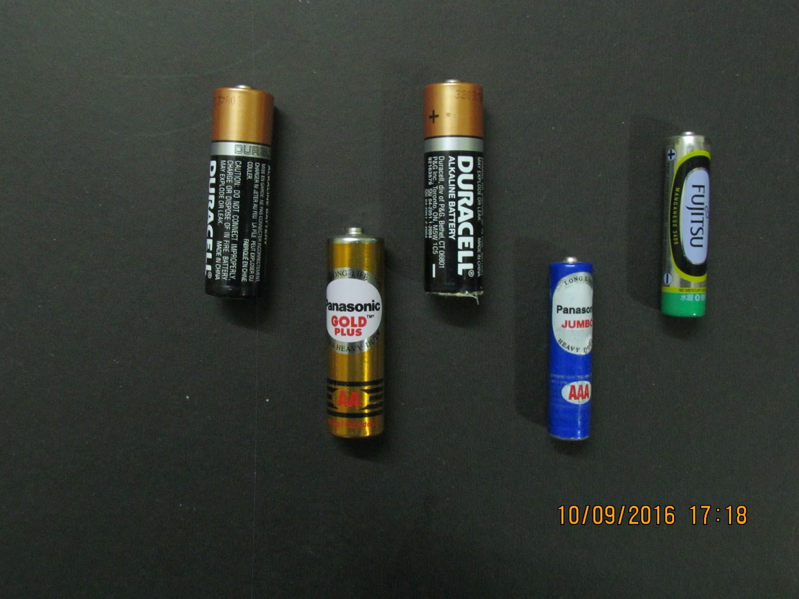
I used battery cells of two different types; pencil cells and AA battery i used batteries and placed them this way to show continuity and used two different battery types to capture similiarity even though there is a break in the similiarity of battery type.


I captured this image actually capture a ''bonus feature'' sort of principle pragnanz  but i must say i captured proximity, continuity and similiarity as well.


In this another composition of mine i have tried to capture continuity, similarity and proximity  and show a form familiar to a coconut tree.


In this image i have used the books stacked on a shelf  as a reference for continution  by stacking same size in length and breadth stacked together.


This composition shows closure, proximity, continuty and similarity. I created this composition inspired by the 8 bit galaga game we are familiar through video game parlours back in the 90's.


The use of bottles to show continuity in size


Here in this composition i have created through usb wire cables i have tried to show how proximity and similarity create a form or a shape.


Scissors through closure and proximity create a traiangular shape.


Saturday, 10 September 2016

COMMUNICATION SKILLS

BODY LANGUAGE

Body language is an integral part of human interaction. It sets the tone for the dialogue between two or more people.Body language can basically be broken down to;

  • physical gestures
  • posture
  • eye contact
  • speech
  • tone of voice 
The latter two cannot be covered here as i have taken some snapshots. So we will try to understand that in second series. So, here we go!!!!


I took this snap outside my house early in the morning. It was my first shot, but i think it captures the two principle subjects and their body language as well. Here we can see how the little boy is inviting attention from the lady on the two wheeler. But the lady is quite clearly trying to end the dialog as early as possible by not giving any attention.


In this photo we can see how even though how meagre his income is or how hardship makes him suffer he still tries to cloud that by pulling up a smile. We can see his fragility through his thin frame and drooping shoulders.

I hope you got an insight in how we try to communicate even without basic channel of communication: speech.

Tuesday, 23 August 2016

VISUAL DESIGN:PRINCIPLES OF DESIGN SERIES PART III

Today we will study about a principle which falls in composite design:UNITY. 
                                           

UNITY:

Unity refers to the visual quality of wholeness or oneness that is achieved through effective use of the elements or art and principles of design. Variety is achieved when the art elements are combined in various ways to increase visual interest.
In this image we can see how colours and shapes are used to unify the whole painting where visual emphasis falls collectively 
Unity can be formed by using similiar background
here how unity is formed by using similiar background

in this structure we can see the repetition of pillars
Unity can be seen due to repetition of pattern in the architecture

VISUAL DESIGN:PRINCIPLES OF DESIGN SERIES PART II

In this series we will discuss DYNAMIC principles of design which will be discussed in 5 parts:

  • movement
  • harmony
  • repetition
  • rhythm
  • pattern

MOVEMENT:

Movement in visual art or design occurs when we perceive that an object is in motion. Movement or motion can be shown through curves in lines or dots or patterns.


These lines dots then form shapes which in turn shows movement


HARMONY:

The pleasing agreement of parts or combination of parts in a composition --Harmony involves the selection/design of elements that share a common trait, however, Harmony becomes monotony without Variety.
Common traits orientation colors or values shape/size materials variety: the extent of the differences in design elements -- visual interest is enhanced by introducing dissimilar elements and spatial arrangements.
Harmony in visual design means all parts of the visual image relate to and complement each other.


REPETITION:

Repetition is the regular or harmonious recurrence of elements, including: lines, shapes, forms or colors.horizontal (beams) and vertical (columns) Rhythms / Grids, Work connecting points in space.


RHYTHM:

Rhythm is the repetition or alternation of elements, often with defined intervals between them.
Rhythm can create a sense of movement, and can establish pattern and texture. There are many
different kinds of rhythm, often defined by the feeling something evokes when viewed.
  • Regular: A regular rhythm occurs when the intervals between the elements,
and often the elements themselves, are similar in size or length
  • Flowing: A flowing rhythm gives a sense of movement, and is often more organic in nature
  • Progressive: A progressive rhythm shows a sequence of forms through a progression of steps


PATTERN:

Pattern is an underlying structure that organizes surfaces or structures in a consistent, regular manner. Pattern can be described as a repeating unit of shape or form, but it can also be thought of as the "skeleton" that organizes the parts of a composition.Pattern exists in nature as well as in designed objects; it is useful to look at the parallels. A Harvard biologist named Peter S. Stevens has published a book entitled "Patterns in Nature" in which he claims that there are only a finite number of ways that patterns can be structured. He starts with the idea of a grid as the foundation for any structure or image. He presents a set of ways in which the points of a grid can be connected. These modes of connection become classes of pattern, which he claims can be seen in any situation, in nature and in made images, and from the microscopic to the cosmic scale.
There are various types of patterns:

  • flow
  • branching
  • cracking and packing
  • spiral
flow pattern

cracking and packing
spiral pattern
branching


VISUAL DESIGN:PRINCIPLES OF DESIGN SERIES PART I

Hi friends!In this  3 part series we will learn about the principles of design and gain indepth knowledge of the each and every principles as it follows. In part 1 we will learn about different principles followed in static design

  • Balance
  • contrast
  • variety

BALANCE:

It is a state of qualized tension and equilibrium, which may not always be calm it shows a sense of calmness in viewer's eyes.

Balance can be symmetrical ("formal"), where elements are given equal "weight" from an imaginary line in the middle of a piece. For the most basic example of symmetry, think of your eyes in relation to either side of your nose.Balance doesn't necessarily mean symmetry, though.Asymmetrical ("informal") balance occurs when elements are placed unevenly in a piece, but work together to produce harmony overall.

yin yang symbol is a classic example of balance. It shows weighy in colour on both the sides 
the blue colour, the design and the white tone is followed on both sides of the painting


CONTRAST:

Contrast occurs when two elements on a page are different. For example, it could be different colors between the text and the background color. It could be a heading set in a big, bold, grungy font combined with a sans-serif font for the body text. It could be a difference between a large graphic and a small graphic or it could be a rough texture combined with a smooth texture. Our eyes like contrast.
The important thing about contrast is that the elements should be completely different. Not just a little bit different.
zebra's stripes are classic example of two contrasting colours conflicting the same space


in this photo the contrast in colours shows dominnace of the flower

Contrast is not only shown through colour but also the placement and difference in posture or placement for example;


VARIETY:

Variety adds interest by using contrasting elements within the composition.


VISUAL DESIGN:FORM DESCRIPTORS SERIES PART III

PART II


MEASUREMENT:

Measurement principles in visual design are followed almost in every form. Art and design in general follow the same universal principles. To distinguish between two objects principles of measurement are followed almost regularly. Measurement is also used to create depth.Measurement follows following rules;
  •  size
  • scale
  • dimension
In this image we can see that even though the monument is far away it still maintains it's size, scale and proportion in respect to the human figures around